When I set out to design my blog, it made sense to head out into the wild blue yonder of the Internets. Sure enough, I discovered several free bloggy background providers with tons of cool banners to choose from. My immediate favorite was this:
Actually, I still love that. But no matter how I arranged the title Thinking Out Loud, I couldn’t get it to look the way I wanted. So sadly, and with a little bitterness, I moved on to this:
*Well, isn’t that nice.* They provided me with a little box to put the title into. Okay, that was sarcasm - stemming from the fact that I couldn’t make the first banner work. Yep, this yellow one never had a chance.
Think, Kristin! What does one look for in a great, eye-catching banner?
How about photos? Perhaps what I wanted was personal photos to make the banner my own:
Oooooh! Split Rock Lighthouse, Minnehaha Falls, the mighty Mississippi… But what on earth do those have to do with me talking about all the stuff I want talk about?
I needed to think about the things I was planning on blogging about. Well, to start, I love decorating, my family, travel…

This was my very first LIVE banner. And I hated it. My brain was personally insulted that I put that out there for all the world to see. It was boring. Even with that incredibly good looking family on there.
Also, I realized I really needed to add Kadbury Is to the banner since it’s my actual page name. (Why is it Kadbury Is? Go here to find out) It wouldn’t be too smooth to have people entering Thinking Out Loud in their search engines. I am, of course, assuming that people would actually want to find my site. And that they would use a search engine to do it.
Something vital was still missing besides the Kadbury Is part. And then I had it!
What I needed was more color!
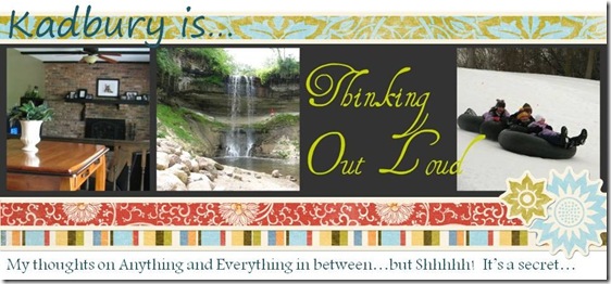
Yeowsa! I actually liked this one. For all of about a week.
But it stuck around for a full month. And at the end of the month, the secret was out. Since I was now going public, I wanted to make a splash, but more than that – I wanted to have a logo. Because logos are awesome, that’s why.
Enter that big blue thing with the swirlies on it. Now, I had all the elements that I wanted: a memorable blue thing, green stripes, two cool fonts…
That last one lasted the longest (and I use that term very loosely considering this blog has only been around for three months). But it took up the entire screen when I opened my site. I really wanted it to look more professional…
After spending an inordinate amount of time looking at blog and consumer website banners, I ended up with what you see today. And I like it. I think it’ll stick around.
At least for the next three months… ; )



8 awesome thoughts:
Good job! I've created several of my own banners as I've tried to find my ideal header. Needless to say, Moonlight and Magnolias doesn't really give you any idea what you might find there but it is memorable.
I've designed for others too; but I had a lot of fun designing my own as my page changed names and such over the course of about 3 years.
I love your new banner with those amazing magnolias! I can almost smell them from here : )
~Kristin
I LOVE your banner! And your button, in fact, your button looks right at home on my page. I am so glad to know that I am not the only one that had that issue. I went through some transitions too. :)
I just wish I could create my own banner--I had such a difficult time trying to do my own button that I have given up and am letting someone else do it.
Through many interations of the banner, you will find what you like and what really fits your vision. That may take banner after banner :)
Mrs. Zwieg and Angela: I've been considering putting some easy blogging tutorials on my page too; I just made a 'favicon' (the red 'K' next to my url) and it was so easy once I figured it out. It's not a part of 'niche', though, that's the only thing that has stopped me from adding bloggy tutorials...
Ha I loved your post. I've changed and rearranged my blog in the four years I have had it at least 85765878937384908 times and I am NOT satisfied with it. I love yours. You did a great job. Maybe I just need to keep experimenting until I find what I like.
@TerriThanks Terri! It really is a constant process to find what works : )
~Kristin
@MoonlightandMagnoliasI know what you mean... Who knows what my page will look like in three years? ; )
Post a Comment